Created in 2021 Building Blocks is a company that focuses on simplifying the processes of the music industry to create a healthier ecosystem for artist and those who approaches the music industry for understanding.
The task was to create a design that felt easy to approach and simple while expressing the idea of giving understanding and knowledge to people who come aboard.
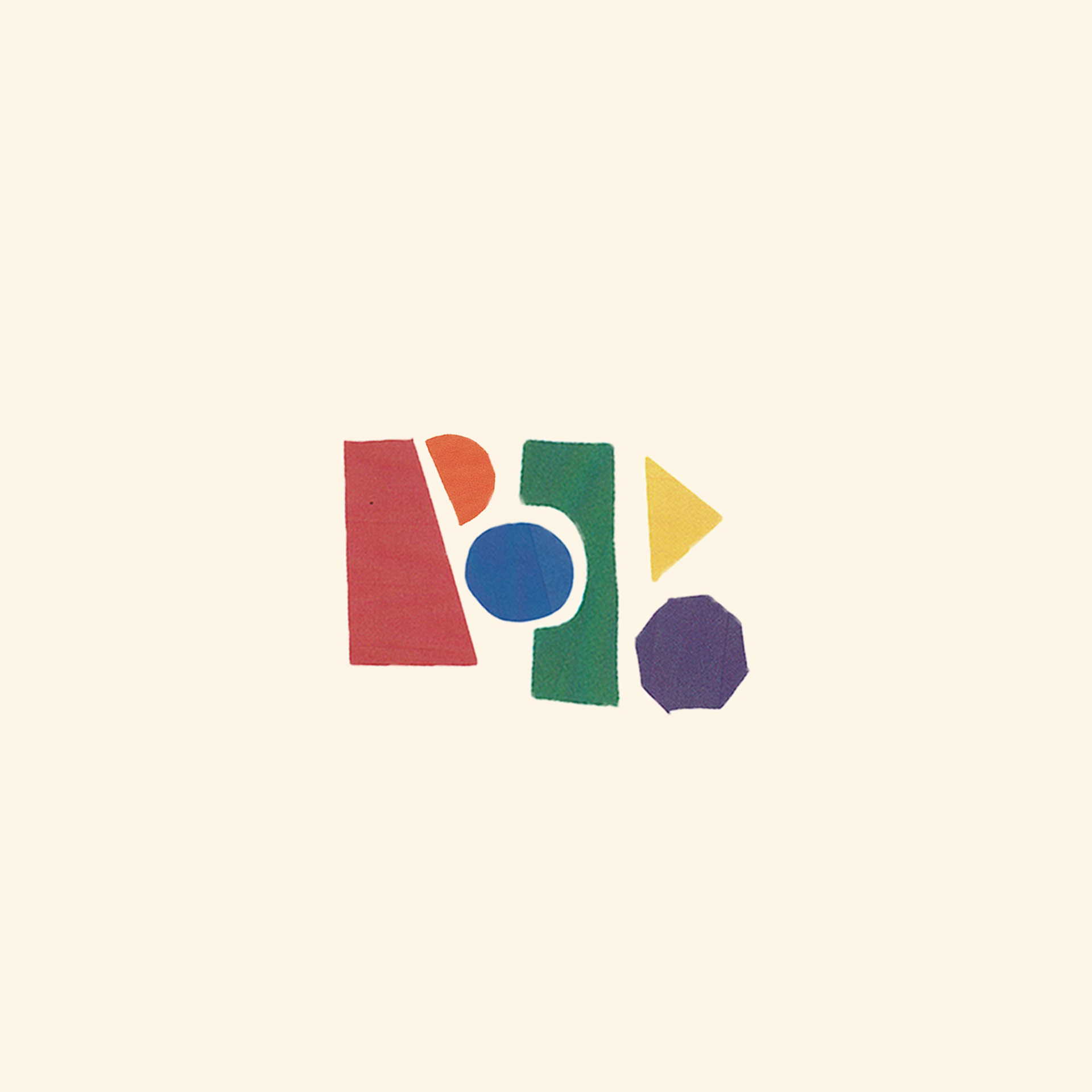
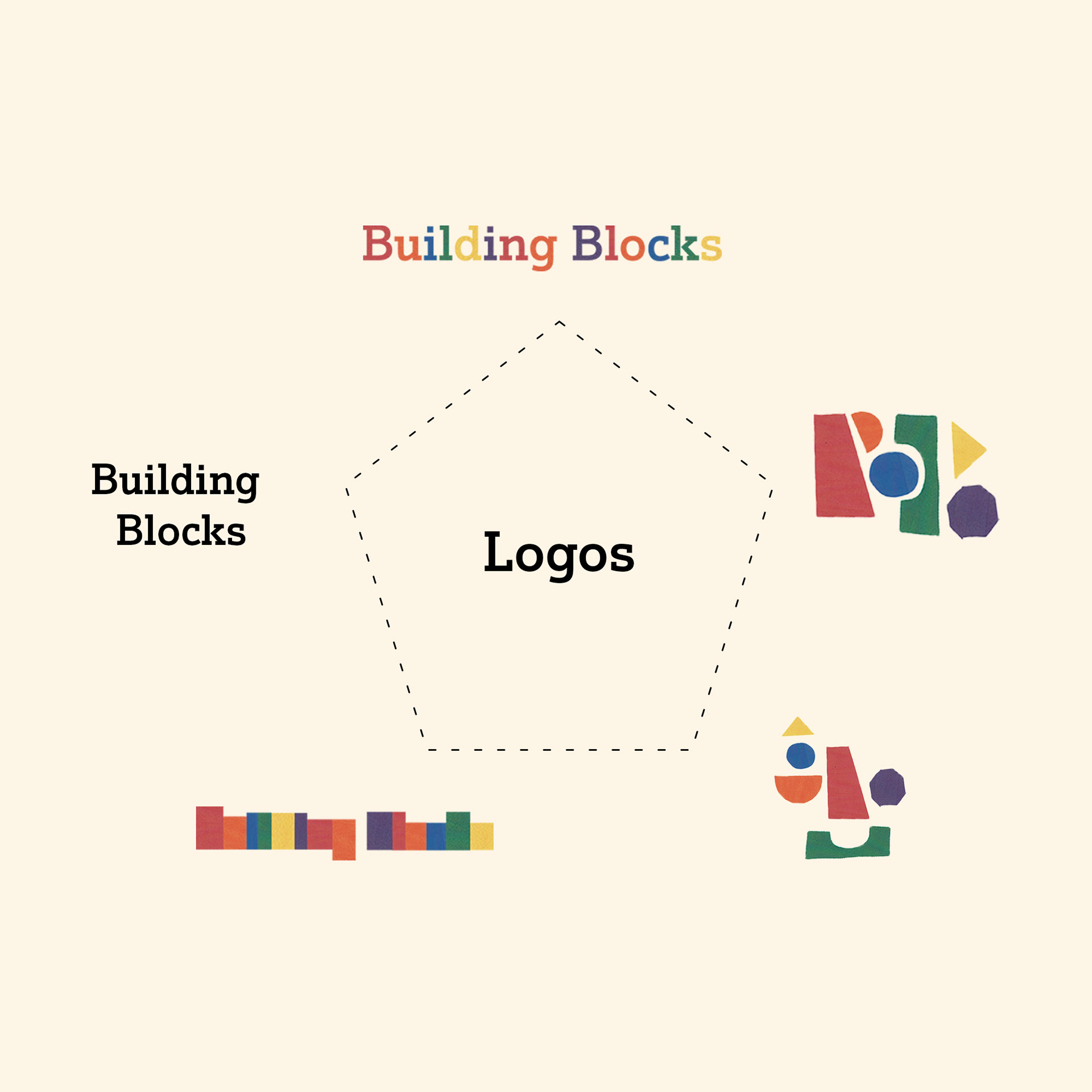
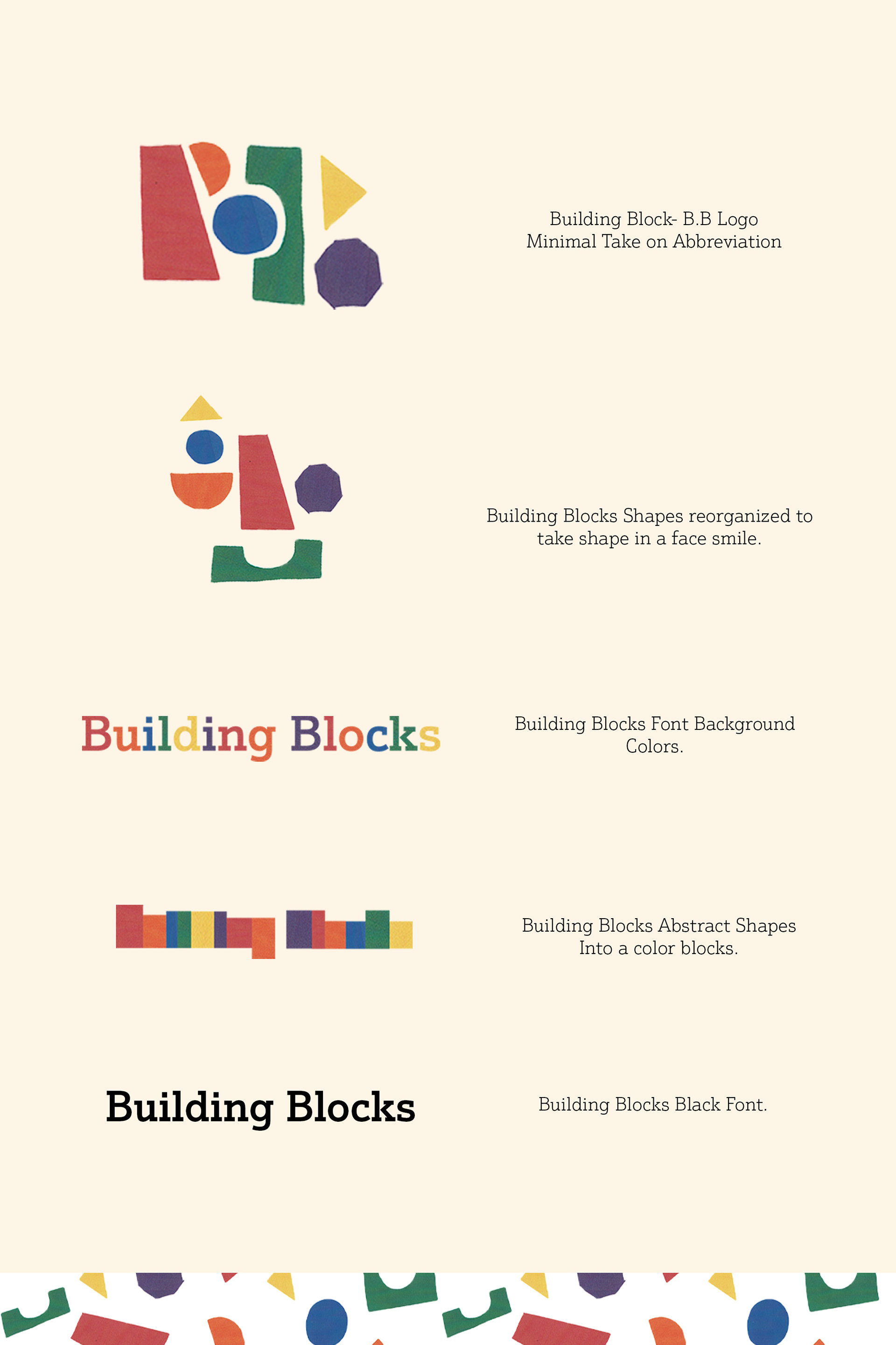
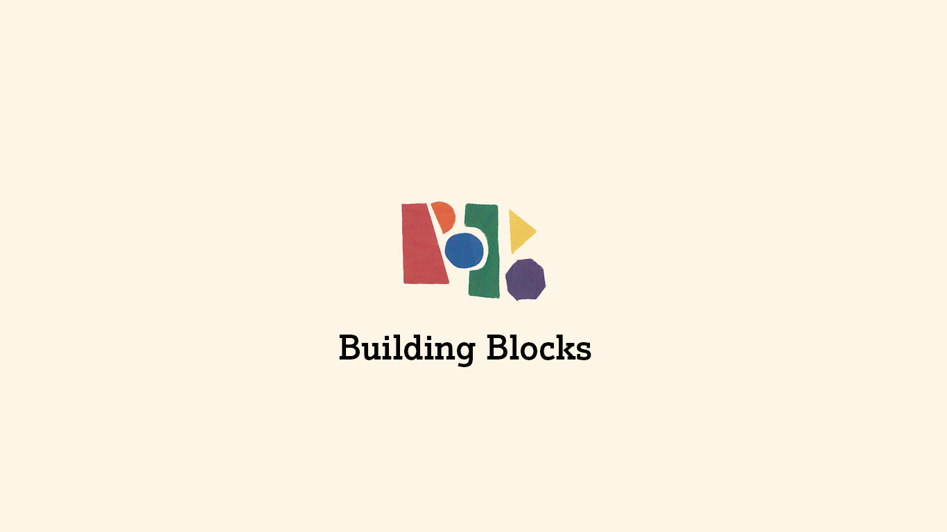
In the briefings, the terminology used to describe Building Blocks in passing was (B.B), so we wanted to create something that took that breakdown of the brand and simplify the overarching idea of what this brand is.
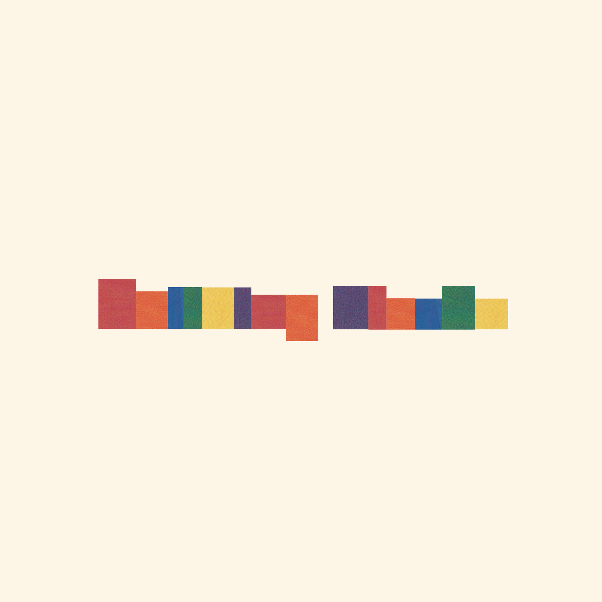
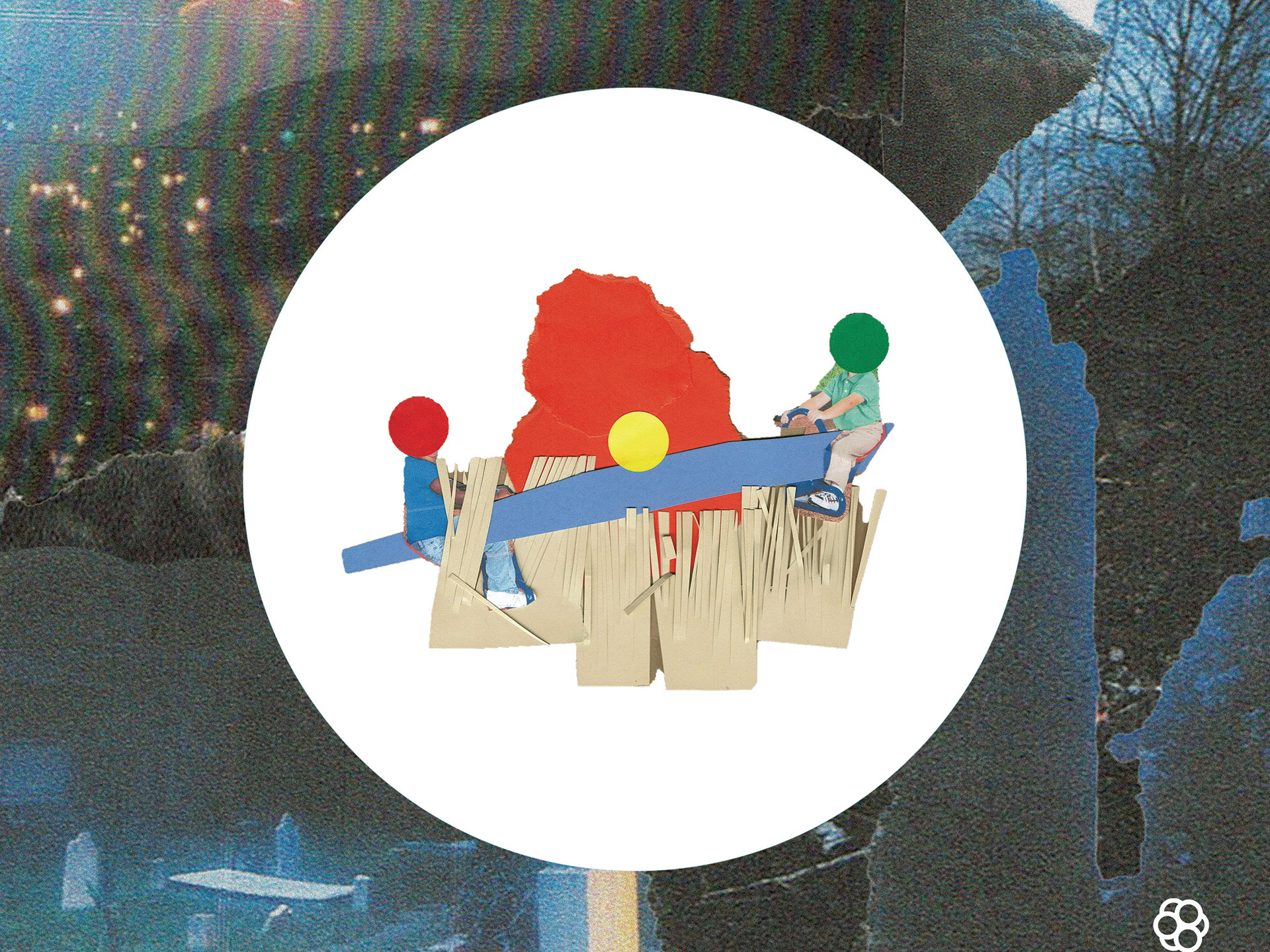
We were focusing on the blocks of color, which had a more extensive symbolism at the end of identifying with the brand's core beliefs. We decided that because those foundations make the brand, we needed to express the importance of utilizing those shapes to create the identity of Building Blocks.
So we built out the logo in the shape of two B's, but in our case study, we also wanted to show how the shapes and blocks can be reorganized to tell more visual stories, so we decided to create a smile to make the brand even friendlier.
Created by: OKVY.CO
Designed by: MICKY BROWN
Follow on Instagram @okvy